Spatial process or social residue?

Modeling the joint socio-structural and spatial drivers of infection inequity

Statistical Methods for Infectious Disease Across Scales
Penn State University
2024-04-05

Jon Zelner
Dept. of Epidemiology
Center for Social Epidemiology and Population Health
University of Michigan School of Public Health

✉️ jzelner@umich.edu
🌐 epibayes.io

Agenda

  • Brief overview of what has - and hasn’t - been done to mechanistically link residential segregation to infection inequity.

  • An attempt to make sense of the impact of different aspects of segregation on basic quantities like \(R_0\).

  • Discussion of what this all has to do with spatial analysis.

In the wake of the COVID-19 pandemic there has been a proliferation of conceptual frameworks linking socio-structural inequity to infection outcomes.

(1)

(Figure from Zelner et al. (2))

Figure from Noppert et al. (3))

These are implicitly or explicitly rooted in the fundamental cause approach

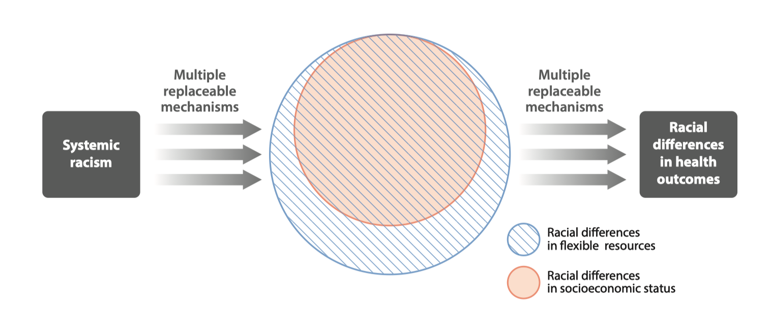
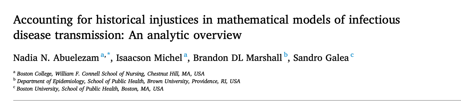
Conceptual model of racism as a fundamental cause of health inequity (From Phelan and Link (4))

Segregation is a general process that goes beyond race and socioeconomic status

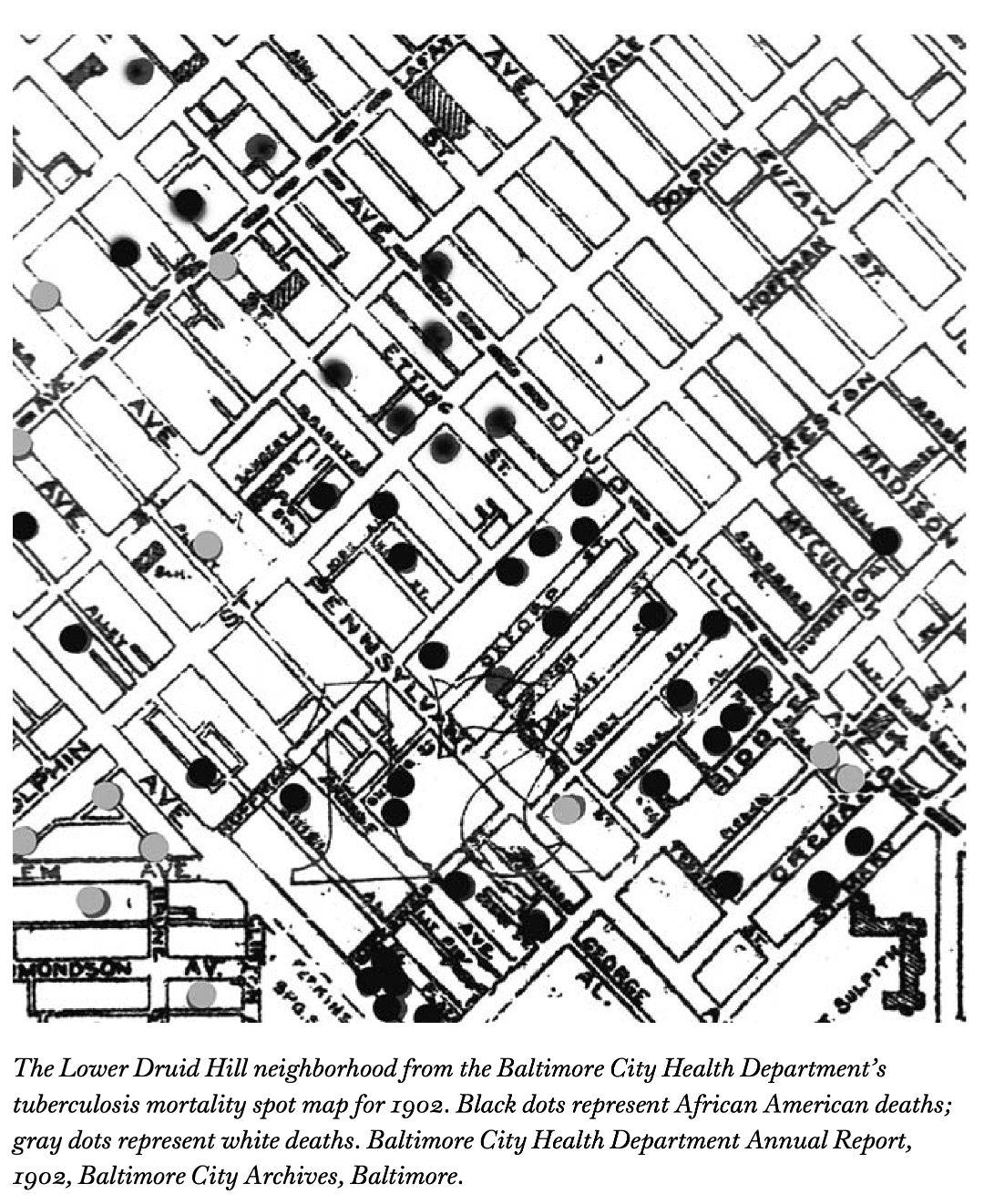
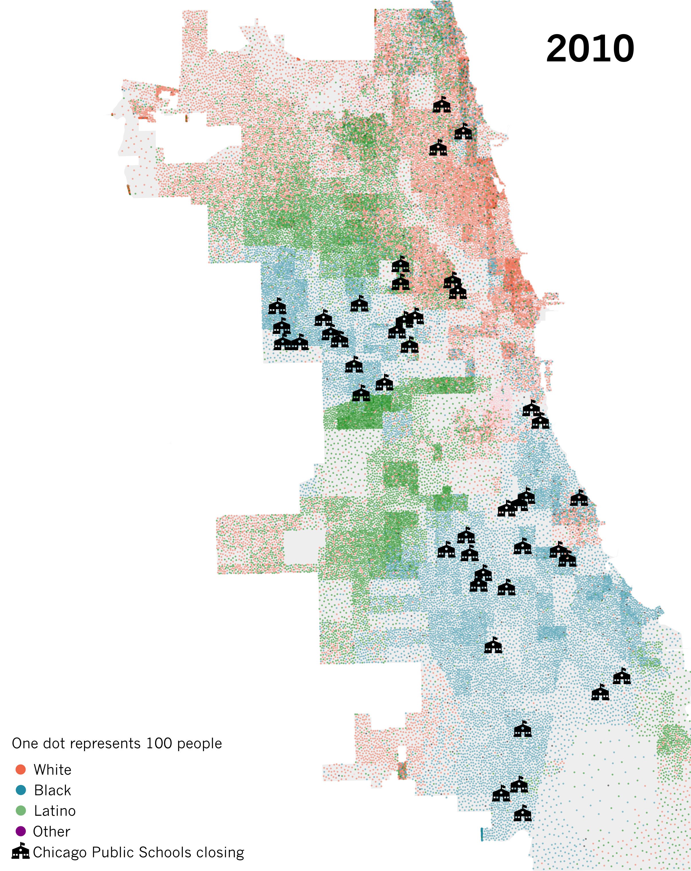
Example of spatial separation of Hindus and Muslims in Mumbai from Susewind (6)

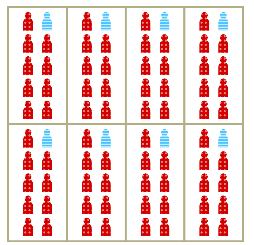
Segregation is a multidimensional process

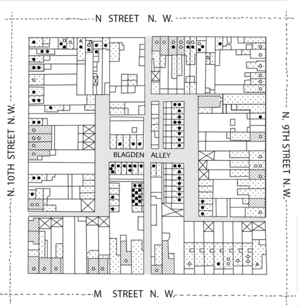
  • Spatial separation is the most obvious feature of segregation.

  • Often captured by metrics of clustering or spatial distributiuon including dissimilarity and Moran’s I.

  • When we conflate separation with vulnerability, we risk attributing the wrong spatial causes to disparities in infection outcomes.

Map showing spatial separation of groups by race and ethnic classificatons in Chicago ca. 2010

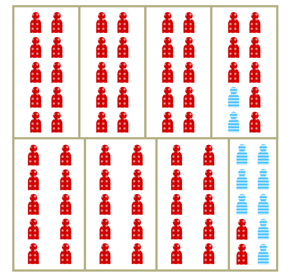
Spatial separation is a hallmark of segregation

  • Dissimilarity measures the proportion of members of the minority group who would have to move to achieve proportional mixing.
  • Commonly used to measure spatial segregation in demographic and disease data.
  • Measure is independent of density.
  • Random mixing occurs in the situation dissimilarity = 0, no mixing when dissimilarity = 1

An example of low dissimilarity adapted from (7)

An example of high dissimilarity adapted from (7)

Increased vulnerability is a less visible aspect of segregation

  • Represents the relative increase in per-contact risk of infection among members of segregated populations.

  • Can also be thought of as relative vulnerability to infection.

  • May result from household crowding, increased occupational risk, comorbidities and other factors

Example of high separation and relative density adapted from (7)

Lage-scale separation isn’t necessary for segregation to drive inequity in risk

Example of ‘alley segregation’ layout characteristic of southern and near-southern U.S. cities (8)

Disparate TB mortality outcomes in Baltimore (From Roberts (9))

So, what does segregation do in the context infection risk?

flowchart LR
  AA{{Structural Racism}} --> A
  A[Residential segregation] --> B(Spatial Dissimilarity)
  A --> C(Increased vulnerability)
  C --> D{Infection <br> Inequity}
  B --> D

These pathways individually and jointly impact infection outcomes. But how? (Adapted from Acevedo-Garcia (7))

Time for the the rubber to meet the road! 🔥

As a public employee of the state of Michigan, I am contractually obligated to include at least 1 (one) automotive metaphor per talk.

We’ll use a simple model to chip away at this complex problem

  • \(\epsilon\) controls spatial dissimilarity, i.e. the degree of within vs. between-group mixing.

  • Parameter \(\rho \ge 1\) characterizes the change in risk associated with increasing concentration.

  • Use the spectral approach to estimating \(R_0\) (10) and numerical simulation to understand the implications of these mechanisms.

Including differential contact and vulnerability in the same model

\[ \begin{aligned} \lambda_1 &= \beta \rho S_1 \left(\epsilon \frac{ I_1}{N_1} + (1-\epsilon)\frac{I_1 + I_2}{N}\right) \\ \lambda_2 &= \beta S_2 \left(\epsilon \frac{I_2}{N_2} + (1-\epsilon)\frac{I_1 + I_2}{N}\right) \\ \end{aligned} \qquad(1)\]

Simple SIS infection dynamics

  • Representative of an endemic infection with no protection against reinfection.

  • Useful for looking at broad patterns of inequity.

  • Pathogen-specific natural histories will be necessary for thinking more concretely about interventions etc.

\[ \begin{aligned} \frac{dS_1}{dt} &= - \lambda_1 + \gamma I_1 \\ \frac{dS_2}{dt} &= -\lambda_2 + \gamma I_2 \\ \frac{dI_1}{dt} &= \lambda_1 - \gamma I_1 \\ \frac{dI_2}{dt} &= \lambda_2 - \gamma I_2 \end{aligned} \]

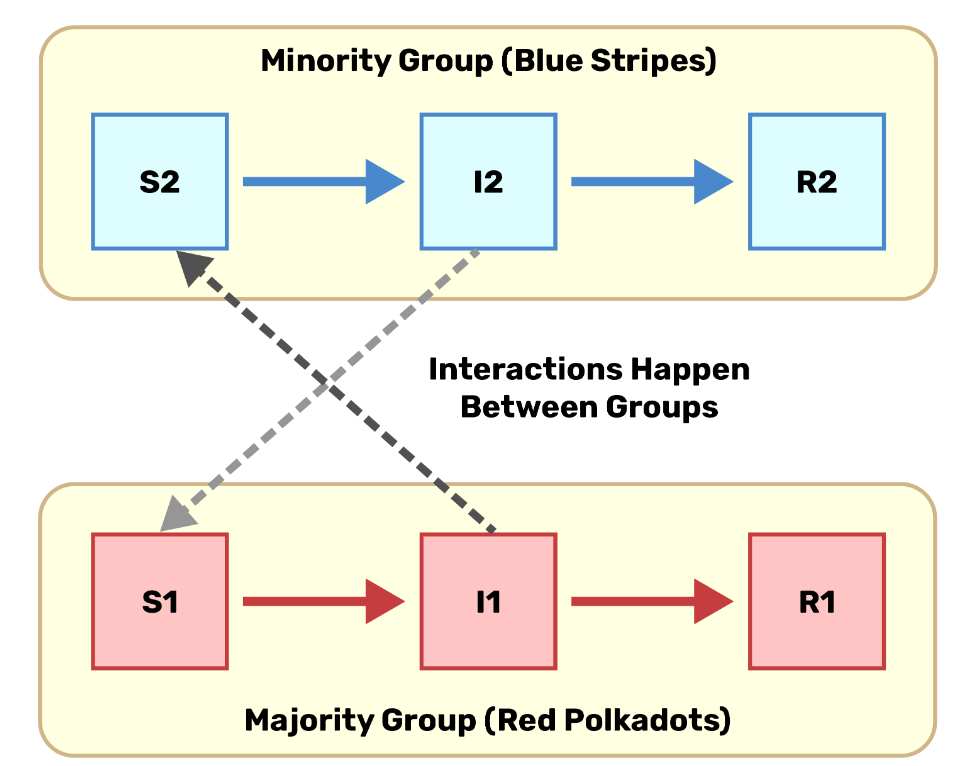
How does \(R_0\) scale with contact and concentration?

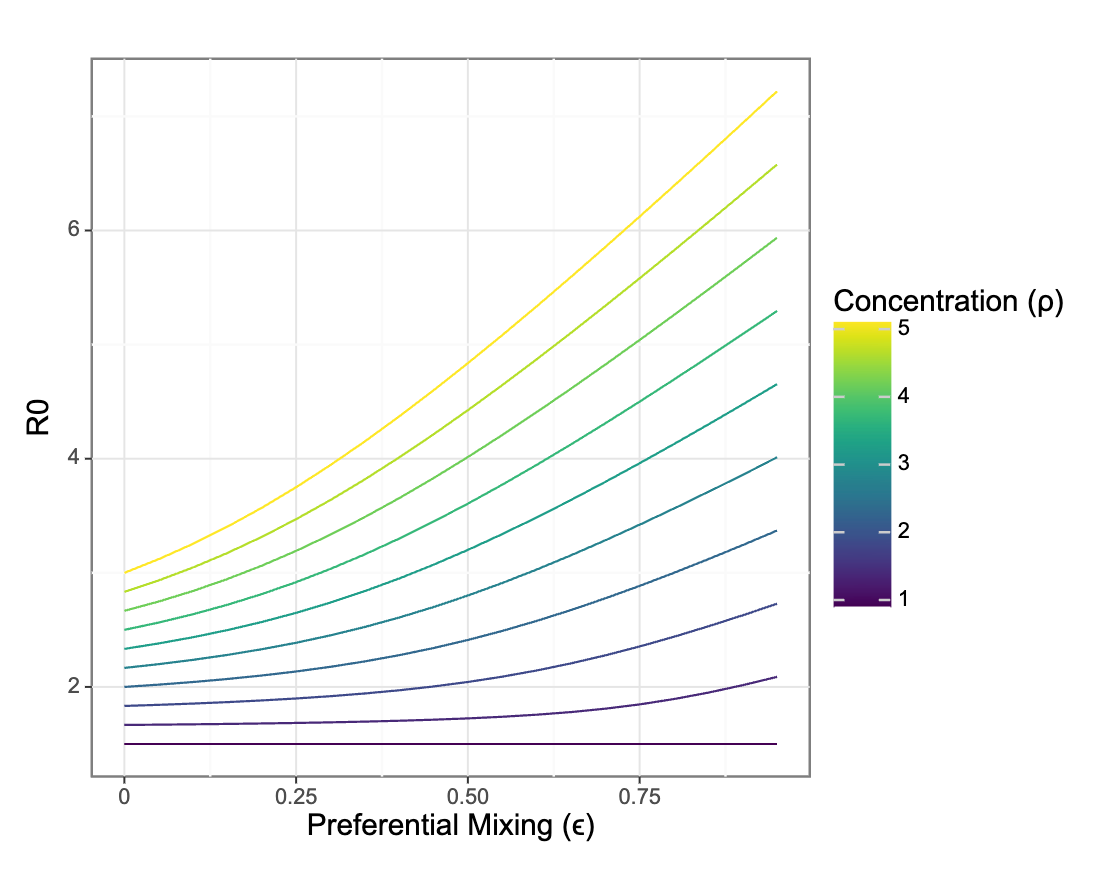
Preferential mixing only impacts R0 in the presence of differential vulnerability to infection between groups

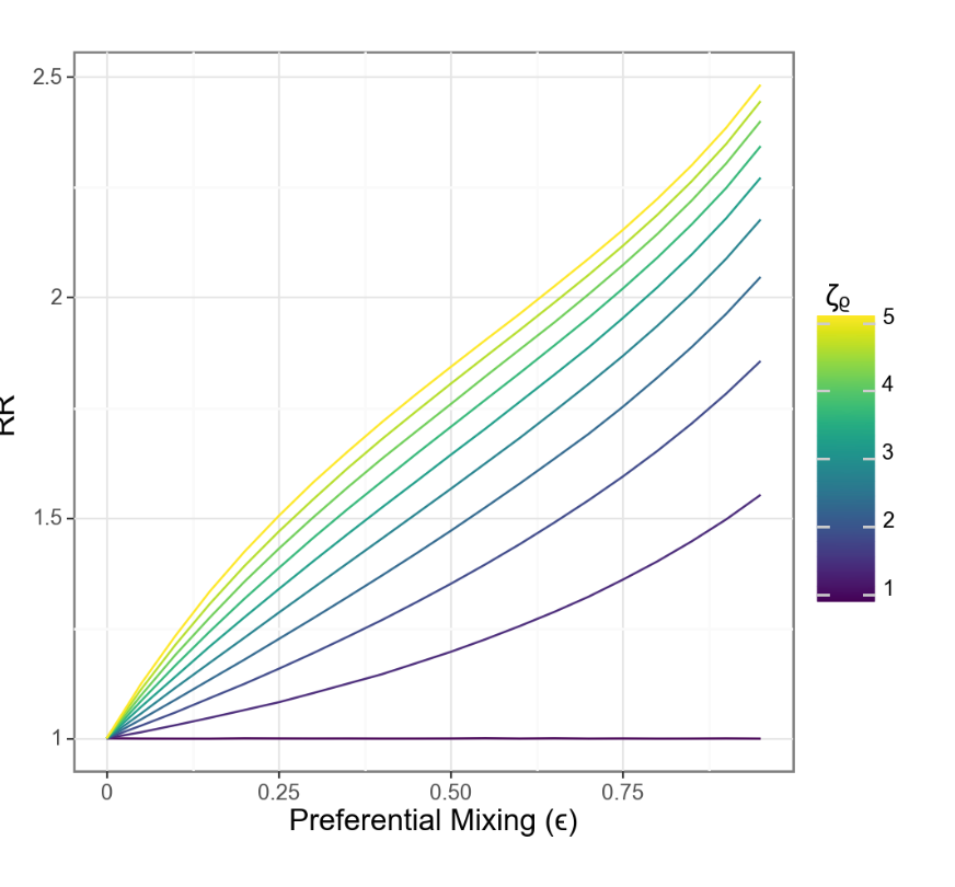
What about relative risks between groups?

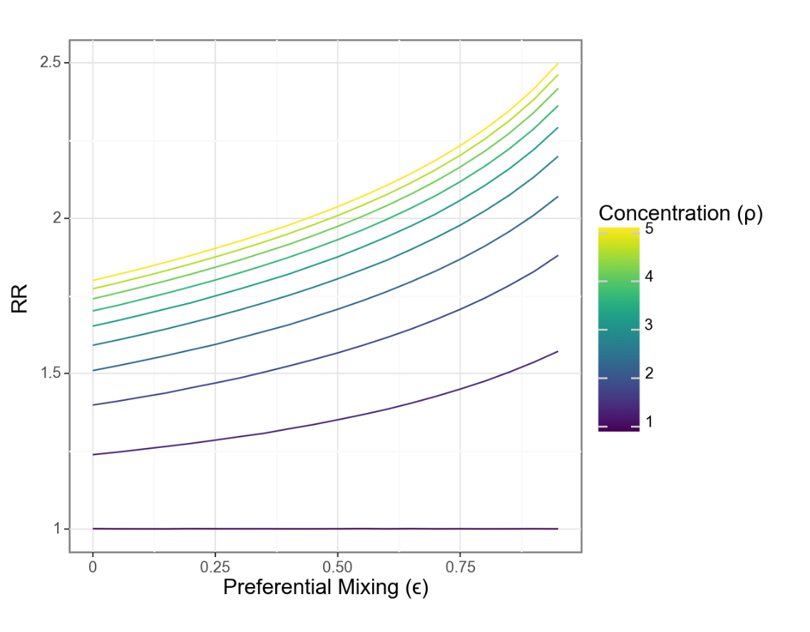
Changes in relative risk are driven by the interaction of concentration and isolation

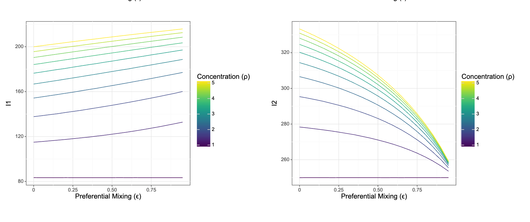
Risks for each group move in different directions even as relative risks grow

But: We’re missing an important ingredient

flowchart TD
  AA{{Structural Racism}} --> A
  A[Residential <br> segregation] --> B(Spatial <br> Dissimilarity)
  A --> C(Increased <br> vulnerability)
  C --> D{Infection <br> Inequity}
  B --> D

We should expect the observable dimensions of segregation to be correlated since they share a common, fundamental, cause.

We can model \(\rho\) as a function of \(\epsilon\)

\[ \rho(\epsilon) = 1 + (1- \epsilon) \zeta_\rho \]

Where \(\zeta_\rho\) is the maximum vulnerability when \(\epsilon = 1\)

A more intuitive relationship?

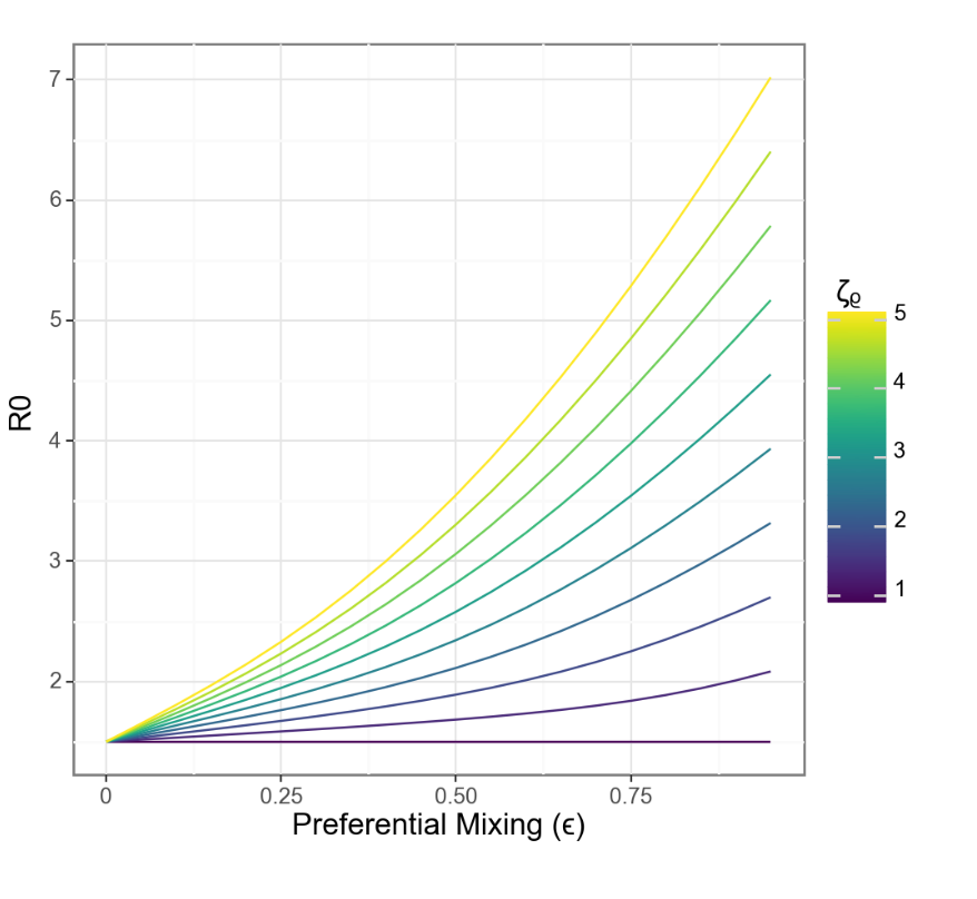
When separation and vulnerability are mechanistically linked, R0 grows linearly with separation

Relative risk also scales more closely with separation

Real-world relationshionships are obviously more complicated

flowchart LR
subgraph IP["Infection Process"]
  A[Residential segregation] --> B(Isolation)
  A --> C(Concentration)
  C --> D{Infection <br> Inequity}
  B --> D
  end

  subgraph MP["Mortality Process"]
  D --> E((Case Fatality <br> Rate))
  E --> F{Mortality <br> Inequity}
  B --> G(Healthcare <br> Access/Quality)
  G .-> 
    I(Comorbidity <br> Prevalence) .-> E
  end
  H{{Structural Racism}} --> A
  H --> G
  H --> I

  style IP fill:none
  style MP fill:none

Figure 1: How do we strike a balance in representing social and biological mechanisms without exploding 💣 model complexity?

⚠️ Data Problems Ahead ⚠️

  • Mismatch between individual-level outcomes and spatialized measures (i.e. ecological fallacy).

  • Increasing reliance on non-mechanistic metrics of social risks, e.g. social vulnerabulity index.

  • Non-random missingness of key demographic covariates (e.g. race & ethnicity).

  • Flaky population denominators that get worse as you break them down more.

Lots to do!

  • We haven’t touched on differential outcomes of infection including death and severe disease.

  • How do we go from this very simple framework to real-world data?

  • What implications are there for prevention and intervention?

Thanks!

  • Work supported by NIMHD R01MD017218

  • For more info abour our research check out epibayes.io

  • Related tutorials and teaching materials on my blog at zelnotes.io

  • Shiny app with an interactive version of this model
  • I have to leave midday tomorrow to hopefully not injure myself at my daughter’s 7th birthday party at a trampoline park.

  • So: Please send me a note at jzelner@umich.edu if any of this is of interest and we don’t get to talk!

References

1.
Abuelezam NN, Michel I, Marshall BD, et al. Accounting for historical injustices in mathematical models of infectious disease transmission: An analytic overview. Epidemics [electronic article]. 2023;43:100679. (https://www.sciencedirect.com/science/article/pii/S1755436523000154). (Accessed March 29, 2023)
2.
Zelner J, Masters NB, Naraharisetti R, et al. There are no equal opportunity infectors: Epidemiological modelers must rethink our approach to inequality in infection risk. PLOS Computational Biology [electronic article]. 2022;18(2):e1009795. (https://journals.plos.org/ploscompbiol/article?id=10.1371/journal.pcbi.1009795). (Accessed February 16, 2022)
3.
Noppert GA, Hegde ST, Kubale JT. Exposure, susceptibility, and recovery: A framework for examining the intersection of the social and physical environment and infectious disease risk. American Journal of Epidemiology [electronic article]. 2022;kwac186. (https://doi.org/10.1093/aje/kwac186). (Accessed November 3, 2022)
4.
Phelan JC, Link BG. Is racism a fundamental cause of inequalities in health? Annu. Rev. Sociol. [electronic article]. 2015;41(1):311–330. (http://www.annualreviews.org/doi/10.1146/annurev-soc-073014-112305). (Accessed December 15, 2019)
5.
Williams DR, Collins C. Racial residential segregation: A fundamental cause of racial disparities in health. Public Health Reports. 2001;116(5):404–416.
6.
Susewind R. Muslims in indian cities: Degrees of segregation and the elusive ghetto. Environ Plan A [electronic article]. 2017;49(6):1286–1307. (http://journals.sagepub.com/doi/10.1177/0308518X17696071). (Accessed September 30, 2022)
7.
Acevedo-Garcia D. Residential segregation and the epidemiology of infectious diseases. Social Science & Medicine [electronic article]. 2000;51(8):1143–1161. (https://linkinghub.elsevier.com/retrieve/pii/S0277953600000162). (Accessed December 15, 2019)
8.
Logan J. Racial segregation in postbellum southern cities: The case of washington, d.c. Demographic Research. 2017;36:1759–1784.
9.
Roberts SK. Infectious fear: Politics, disease, and the health effects of segregation. University of North Carolina Press; 2009.
10.
Diekmann O, Heesterbeek JAP, Roberts MG. The construction of next-generation matrices for compartmental epidemic models. J R Soc Interface [electronic article]. 2010;7(47):873–885. (https://www.ncbi.nlm.nih.gov/pmc/articles/PMC2871801/). (Accessed November 2, 2023)